Eportfolia Game Scene Post 4

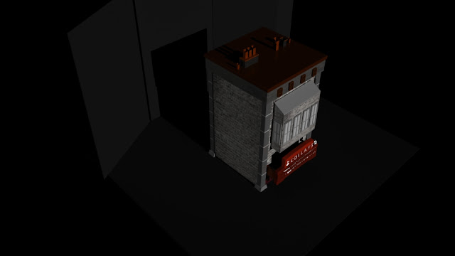
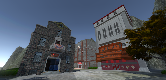
Ragalla Seliby--Kaplan I was UVing the rest of the building, such as the sign, and front doors which required a different texture than the base building due to how different and honestly contrasting it was. The red hue from the light was difficult to get but I used a texture of grey light marble and provided it with a red hue to make it appear red from the lights from under the sign. The text for the sign was also a bit of a hassle, as I used to Text available in Maya to make it but as you can see from the concept and official art some letters are missing and others are positioned awkwardly. I had to separate and arrange them all separately to make them fit but what really was an issue was the inconsistency between artworks. The concept art features different text than the official art and both of them are rather hard to make out. I decided to follow the concept art more as it allowed for a front view making it easier to model. The posters and shingles in the front we...


