Posts

Ragalla

CAGD 345-Final Project
Image
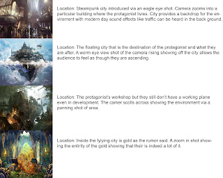
Ragalla Selib-Kaplan 345-Project Final Animatic Description: Using all our story boards, working off our concept sheets, and using our log lines we were task to create a final animatic of your story that is at minimum a minute long. The animatic would have necessary sound effects that are public domain and therefore free to use and voice acting when ever necessary. Once completed we were task with putting together all our resources in a final turn in folder and made available to the class for our animatic critiques. Story Title/Summary: Castle in the Sky ·          The story follows a young inventor who after hearing rumor of an ancient flying city that is home to boundless undiscovered treasure, plans to build a flying machine to find this city and make a name for himself but due to the expenses of building such a ship he has rand into a major road block that may cancel his plans before they even get off the ground. While working he meets a woman who offers to fu

3D Level 2 Feedback

Image
Ragalla Seliby-Kaplan  When designer my latest 3D level I manage to incorporate the more open-ended design but encountered some issues from my critiques. Starting out I made 3 mandatory areas that had to be explored but   I set them up in a way that allows the player to talk them in what ever order they like and even have them be settled on a platform that allowed them to over see the level before going their so that they know perfectly what they are getting into and what would be the best option to start with. I made each of them based on a specific gimmick such as platforming over acid, combatting monsters, and dodging moving blocks that could crush you. At the end you must hit a switch and go out the same way you came in but if you made it through the first time a second go around would be easy. My playtesting showed that people appreciated being able to see what lied ahead of them before going there as it allowed them to go about the level in whatever order they liked in

ePortfolio Progress 3

Image
Ragalla Seliby-Kaplan I UVed several of my main items in my scene but as I'm still playing catch up I have a couple more left to complete. The project overall is going well enough as I am getting my work done in a timely manner and all of my items are on my laptop where I work.  I plan on UV the rest of my work very soon despite you recommending we be done with UVing by now. I know I'm behind but I am juggling multiple projects so I make time where I can especially considering that this is one of my later works. The cart UV came out a bit weird as I used both my own and auto UV to see what it would come out like. I plan on redoing this UV as I feel the size of the UVs are disproportionate. I think this had something to do with me resizing the image to make it easier to work with and think shrinking it down. I'm not sure if that would cause an issue but I wanted to check anyway. This UV also had issues with my laptop and campus computer UVing my work di

3D Game Level Feedback

Image
When making my 3D level I followed the tutorial presented to us in class and unfortunately used the detailed environment design rather than the simplified one which explains the time it took my assignment to upload. Despite this I still manage to implement the design I was going for using the model presented to us with the Disney example of a center place of interest and areas surrounding it being interest points to hook customers into seeing the whole park. I wanted to implement something similar but much more simplified. The idea was to have a center area that looped outward and had players to further out to explore and have to find some keys and head back to the center in order to reach the exit but ultimately I had fail in that ambition but with tools like this I can definitely see myself coming back and making something of this scale a bit more detailed for my final product. I wanted something a bit more exploratory that had you going inside some not to deep caverns to l

Megaman Level 2

Image
When designing my Megaman level 2 I wanted to have a Metroid Vania style exploration element to the overall level. Despite the level I turned in being an incomplete version I managed to make the intended level and had friends and people online test the level and even provide me with feedback via email. The design was a strait forward linear level with now peaks or troughs at first glance and eventually you reach a door at the end of the level where you need 4 keys. To find the keys you must engage in activities you might night even think was a wise choice on your first run through. Jump to heights on platforms mysteriously higher than normal and arranged in a stair like manner gets you into the upper portion while falling through a pit gets you to the lower half. I also avoid death pits in general as to not lie to the player about some pits being okay and other not because I feel like that’s pretty cheap the design allows for players to explore and get the keys needed to succeed wi

Megaman Level 1 Version 2 Feedback

Image
Ragalla Seliby-Kaplan When developing the second level using the first as a base was a simple task as I was able to implement various aspects of design I wanted in my previous level. Unlike the last level however I felt like I ran into the problem of inconsistency as when making this one I mainly went by the seat of my pants when designing it. Ultimately, I had a clear vision of the max size of my level and how I wanted it to end but getting there was basically me filling up the spaces until I got there.  The linear levels I want to avoid as I feel they are too simple.  When making the level I had much more creativity flowing from me than last time as I was used to the system even after the updates. Creating levels was like drawing and I just let whatever came to me out and honestly if worked out in my opinion for the best. I kept the overall linearity of the level deciding that if I was going to expand the overall design into having more roots then I was going to hav

Megaman Level 1 Feedback

Image
Ragalla Seliby-Kaplan When creating my Megaman level I looked up other levels from Megaman 6 and Megaman 1 specifically. I looked up the overall size of each level and wanted to make something of equal length if not a bit shorter. While I have not played a classic Megaman game in a while, but I have played the x series which is overall the same. When working with the Megaman level design I counted the number of squares necessary to make the level the right size and proper length. When developing I will admit it took me a but to get the hang of the program but after that making levels was a bit easy and fun. I made the levels linear as it was supposed to be as and kept up with the usual Megaman level design methods. While not using spikes, I wanted to avoid pits at all cost but compromised and used them but avoided things that I personally felt were a bit cheap such as enemies on small ledges. Due to the lack of enemy variety I decided to have them placed in unique areas to add varie